Space-News
Check out the result here at www.space-news.ch. A huge thanks goes to my team: Nick and DeValdi. Check out the whole source code here.
Introduction Link to heading
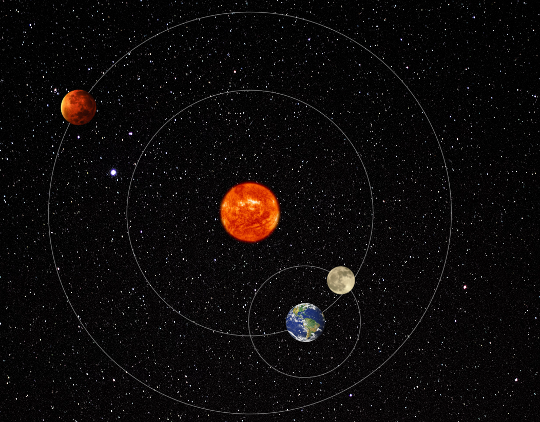
The primary goal of this project was to present astronomical data with a particular focus on Earth, Mars and Moon in a visually appealing and user-friendly manner. The initiative was born out of the realization that astronomical data, while inherently fascinating, often presents challenges in terms of accessibility and user engagement. Using information from NASA and Visual Crossing, our aim was to bridge this gap and provide users with an immersive experience that not only informs, but captivates.
Methodology Link to heading
Website Link to heading
Decisions & Workflow We very quickly narrowed down our choice of depicted celestials to the Earth, Mars and Moon. This allowed us to work concurrently on different sub-projects whilst also having enough API’s to choose from (contrary to e.g. Venus). With our primary goal determined, we had to decide on a select number of API’s from the rather big pool of candidates. This required some careful thinking ahead, as some API’s catered to the same abstract idea (e.g. data about Near Earth Object’s), but ultimately provided completely different data fields for that idea. Eventually, we managed to settle for a handful of API’s that fit our needs. With the backend as an additional sub-project and regular weekly meetings, we were able to individually work on different parts of the website whilst retaining visual coherency and staying focused on the grand scheme of things. To avoid users being confused about the workings of different components, we also decided on including a tutorial on some components.
Earth Link to heading
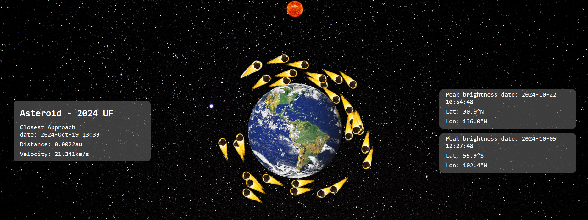
2D Earth In a first step we treated the Earth the same as all other components, that is, depicting it in a 2D fashion with possibly animated and interactive elements to engage with the associated data. To this end, a page with Near Earth Object’s rotating around the Earth and Fireball data cards on the side was constructed. This gave us a good basis on which we could easily build, thanks to the data preparation already implemented, and which we could fall back on in the event of a lack of time. Thanks to our good time planning, we were able to take the next step into the next dimension. The 3D nature of Earth-related data can now be displayed appropriately. With Fireball’s being observed all over the globe, there simply was not enough space to show all that data with countless card components. Depicting the data flat on an image of the Earth would also have forced us to reduce our sample size down to a smaller amount.
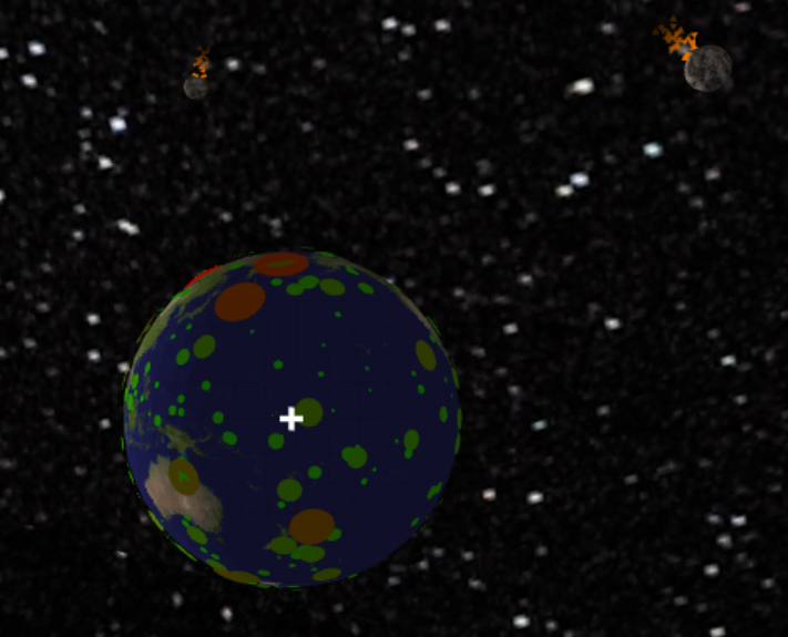
3D Earth That idea, being of course, a from-scratch 3D scene depicting both the Earth and its associated data. Numerous choices regarding the engine and other libraries needed to be made quickly. We decided on using WebGL for our rendering engine, as we already used it in another course at ETH. We also decided to take on the challenge of designing a hand-made linear algebra library, utilizing powerful Typescript generics to ensure size-safety and clever tricks to provide adequate performance. The end product is an interactive and visually engaging website with more than enough space for displaying all of our Earth-related data. Care was taken to mimic the style of the other webpages and to avoid high frequency visual effects in hopes of providing a good experience for people with medical conditions related to vision.
Mars Link to heading
Temperature Graph The aim of the temperature graph was to present NASA’s Mars weather data in a visually appealing way. A challenge arose when the public access service to the NASA API was suddenly discontinued. We solved the problem by finding the hidden API link via NASA’s weather page. Initially, weather information for the past seven days was displayed via cards. Later, a dynamic graph was introduced, allowing users to explore 300 days of temperature data. Having overcome the ’D3’ learning curve, the team improved the useability of the graph in the latest version, incorporating interactive features such as ’mouseover’ events and a ’zoom out’ button for a seamless user experience. Mars Pictures Initially, displaying the latest Mars image as the background proved to be inconsistent with the style of the website as a whole. Clicking on Mars now opens a modal with a collection of random rover images (sourced from ’Opportunity’, ’Spirit’ and ’Curiosity’) for the user to explore.
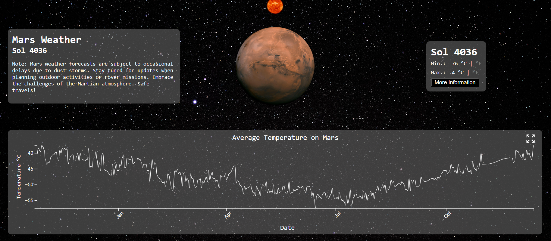
Mars Today Weather One challenge that arose was that there are storms on Mars. Thus, no data is available at times. For example, there was little data between November and December of 2023. Even in the presence of occasional data unavailability, the Mars Weather page always displays recent results. Users can switch between Celsius and Fahrenheit and a ’more information’ button displays details such as weather, season, sunrise, etc.
Moon Link to heading
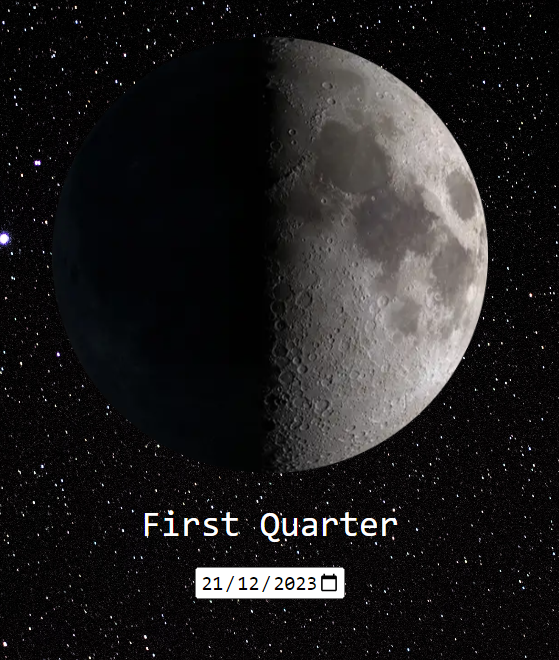
Displaying the Moon The lunar data is sourced from Visual Crossing with a limit of 1000 records per day. To overcome this, the approach has been changed to only display the countdown for the next full moon from today. Users can select a date and the moon phase for that day will be displayed, but the countdown is left out.
Backend Link to heading
Motivation From the beginning it was clear that the backend was not so much required for handling user data, but instead, for serving as an interlink for the often huge amounts of data that are fetched from the different API’s that are queried. As such, a resilient, space- and time-efficient foundation needed to be built quickly so that the development of client-side components could be adapted accordingly in due fashion.
FrameworkvFor our framework, we decided to use Vite and Express for the general setup of our backend. This choice was mostly made due to the experience we have acquired with Express over the course of the semester. In addition, using the same programming language for both front- and backend components allowed us to easily construct communication mechanisms, utilizing built-in features like automatic JSON conversion.
Caching A big part of the backend deals with caching and relaying regularly fetched API data. This includes information like the moon phase or the mars weather, which change their value at most once per day and thus pose a risk of being repeatedly and needlessly fetched everytime a user loads the website. To alleviate this issue, API calls by the client are not directly sent to the responsible API, but rather our backend server. There, the client request gets checked against a library of already requested and therefore cached API responses. If such a response is present, it is immediately returned to the client without any API call. If no response is present, the server makes the API call, caches the response and also returns it to the initially requesting client. If only part of the API response is relevant to the client, the data is first filtered and then stored / relayed in this reduced format. Finally, when the cached entries get invalidated at the end of their lifespan, the server can automatically fetch often-queried values from the respective API’s, which gets rid of the slightly longer waiting time for the first user afterwards. Putting all of these features together, we can greatly cut back on delays, further enhancing the user experience. Logging All registered API’s on the backend have a respective log file, which tracks the lifecycle and any anomalies that arise during API calls made by the associated API.
Result Link to heading
Overall, we have achieved a great website with the following components: Earth, with interactive Near Earth Object’s (NEO’s) and fireball data as part of the Earth. Mars, with a temperature graph for the last 300 days, today’s weather and recent images from Mars. Moon, with a countdown to the next full moon, showing the current moon phase and the ability to display the moon phase for a particular date.
Next Steps Link to heading
As a future project, the following features could be worthwhile as enhancements:
- Accessibility Make adjustments to make it more accessible, such as removing red/green colours.
- Real-Life Button at Home This button could show where the Earth, Mars and Moon are in relation to each other. It would also be interesting to see what a full moon looks like from another point of view.
- More planets Our solar system does not end with the Earth, Mars and Moon. It would be fun to add more components related to other celestials.
- 3D Planets at Home Change the 2D images in the home screen to real spinning planets, akin to the Earth